A comprehensive guide to ecommerce imagery: What do you need for Shopee, Amazon, and Lazada

In the world of ecommerce, a picture is worth a thousand words and the images you choose can ultimately make or break your conversion rate.
Customers are spoiled for choice when it comes to online shopping and it's your job to make sure they like what they see. The right visuals can help you sell products faster than any other marketing material or strategy. If there isn't enough information to give your customers confidence in their purchase they simply won't buy.
The good news is that the proper photography and imagery will show off your products in their best light. It will also empower potential customers by telling them exactly what they will get and how to use it.
So what does it take to create that perfect product listing for your store? Luckily, we've got you covered with this comprehensive guide to ecommerce imagery on Amazon, Lazada, and Shopee.
In this article, we'll discuss the importance of having the right images to sell your products and how visually optimizing your listing will improve your results.
We'll also cover ecommerce products' best practices on adding lifestyle images and graphics to increase conversions. As well as a summary of the formats and types of images you can include on each of the major ecommerce sites.
Types of Images You Need for Ecommerce
Amazon, Lazada, Shopee, and most ecommerce platforms use two types of images on each product listing.
1. Main or Hero Image
The main image has a significant impact on the success of your ecommerce page.
It's the 'face' of your product, so it's essential to choose one that encourages them to take a closer look at what you are selling. It's essential to use a professionally shot, high-quality image that clearly depicts your item for sale.
This image has clear specifications on Amazon which requires a plain white background with no background infographics or text. Ensure that your product fills at least 85% of the frame to make the most of the available space and stand out on search engine results pages.
On Lazada, and Shopee a white background is recommended by but not required. You can add frames, infographics, logos and watermarks. Lazada recommends that the product fills at least 80% and Shopee at least 70% of the frame.

2. Gallery Images
To support your main image you can include an additional 7-8 gallery photos. These images and videos are used to add context to your product and can include backgrounds, people, props, text, and graphics.
These gallery images give sellers the opportunity to show how their product works and visually communicate the benefits to prospective buyers.
Online shoppers love to compare items online and by including photos showing more detail and context you will give your listing an advantage.

Ecommerce Image Specifications
When it comes to listing your products on an ecommerce platform, always use high-resolution images. This will ensure that the image quality is not compromised. It allows your customers to zoom in on specific parts of the product without pixilation and fuzziness.

Photo Formats
- Amazon : TIFF (.tif/.tiff), JPEG (.jpeg/.jpg), GIF (.gif) and PNG (.png) format
- Lazada : JPEG (.jpeg/.jpg)
- Shoppee: JPEG (.jpeg/.jpg), GIF (.gif) and PNG (.png) format
Minimum Image Requirements
Most ecommerce platform will recommend using a 1:1 square image and at least meet the following minimum pixels :
- Amazon : 1000 x 1000 pixels. Maximum 10,000 x 10,000 pixels, 10MB
- Lazada : 330 x 330 pixels. Maximum 2000 x 2000 pixels, 3MB
- Shopee : 500 x 500 pixels. 2MB
Number of Images You Can Upload
Here's the maximum number of images you can upload, including the main idea.
- Amazon: 9 images
- Lazada: 8 images
- Shopee: 9 images
How To Craft Compelling Ecommerce Images
It goes without saying that all the images you use to sell your product should be high quality and professionally presented. Equally important to how it looks is the content of each image and with each platform supporting up to 9 images you have the opportunity to highlight key details of your product.
What to Include in Your Product Listing
Compelling images for most ecommerce platforms make effective use of these three elements:
- Plain product shots
- Lifestyle shots
- Text overlays or infographics

Plain Product Shots
Most ecommerce sites require straight product shots on a white background because of three fundamental reasons:
- It keeps distractions to a minimum
- It makes your product the star
- It gives the platform a consistent feel
Don't forget to include additional shots showing both the back and front of your item and any other angles which have unique features.
Lifestyle Shots
Lifestyle shots are an essential way to communicate how your products are used and can fit into a prospective buyers lifestyle.
As well as depicting features and use cases for your product, adding lifestyle or in-situ shots to your listing can bring a relatable human element and warmth to your brand.
A few ways you can use lifestyle images to sell more products are:
- Adding locational context to where the product is used or stored
- Capturing the enjoyment and benefits of using a product
- Highlighting key details and features
- Showing the formula or what's inside the packet
- Demonstrating how a product is used or functions
- Depict accurate size by showing it with a person or recognizable object

Text overlays or infographics
Combining text overlays onto images or creating info graphics is a handy way to visually communicate more information about your product. Some ways they can help support your listing are:
- Listing out the ingredients or product formulation
- Step-by-step graphics showing how to use a product
- Highlighting key benefits and use cases
[#cta]
Visual Examples of Great Ecommerce Images
With up to 9 images at your disposal it is essential that you curate a selection of images that showcases all aspects of your product. Here are some great examples we found of brands optimizing their galleries to visually communicate key details and relevance to their target markets:
Adding context to show where an item is used
Using images of your product being placed and used within the home is a great way to get your customers imagining it in theirs. According to BigCommerce, 78% of online shoppers want photos that show products in context to see how and where they are used.

Demonstrate Use and Highlight Key Features
Lifestyle photography is a great way to show your customers how a product is used and point out the benefits. You can even use text overlays or arrows to direct their attention to unique aspects. Helping your customers to visualize benefits can increase revenue per customer by 17%

Styling your product with sensory elements
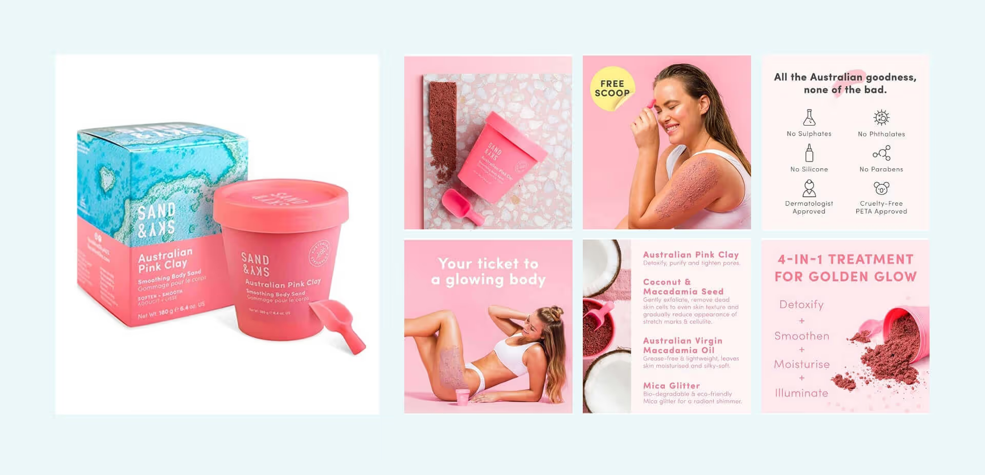
Add some personality to your product with colourful styled product shots and key props. Your customers can't touch or feel your product so it's always a great idea to feature your formula to show them what's inside!

Combining lifestyle images with infographics
You don't just have to stick to one type of visual! You can add text or informative overlays onto your lifestyle images and get the best of both worlds like the examples below.

Aim for Cohesiveness In Your Listing
Establishing a consistent brand visual identity is a great way to capture the attention of potential customers from the get-go. This means maintaining a consistent level of quality not just in the hero image but also in the graphic design and lifestyle pictures.
Your gallery images are a vital way to communicate not only how a product works and it's benefits, but also your unique brand personality. Styled product images fused with your brand palette and images of your target market are a surefire way to connect with your audience.

When you're selling products, you still have the experience to offer. When customers see that your images convey consistency (great lighting, consistency in brand colours, and cohesive lifestyle images and graphics), it builds trust. It shows you know what you're doing and that you are presenting your business accurately.

The rise of ecommerce has made it more critical than ever to have quality product photography and a strong brand presence. High-quality images will entice customers who may not be able to see the products in person or touch them before they buy. The best images show them not only what you are selling but why they should buy it.


%20(1).png)
%20(1).png)


